Find out why Wes Anderson’s movies are loved by designers
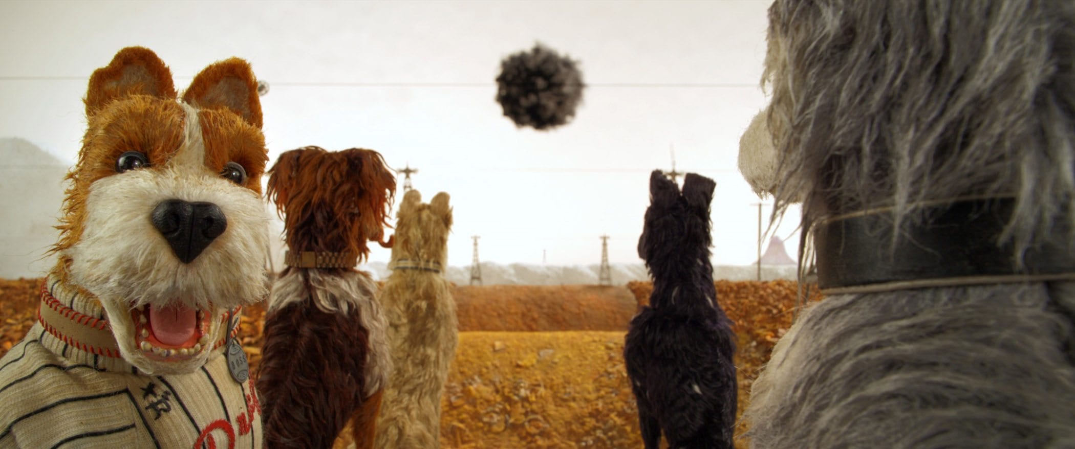
Wes Anderson bagged Best Director at last year’s Berlinale for his new stop-motion feature Isle of Dogs, so we’ve decided to take a look at some of the writer-director’s best works from a visual angle, exploring why he’s gained his reputation as the “King of Symmetry”.
Anderson has never made a bad movie. Period. And while his portfolio is filled with charming storylines, whimsical dialogue, and oddball characters, it’s his visual style that trumps all.
Already inspiring a new generation of filmmakers, Anderson’s aesthetic is characterized by pastel-hue colors, one-point perspectives, and an attention to detail bordering on the obsessive, resulting in movies that – even with the sound off – are a stimulating pleasure to watch.

Meticulous attention to detail
A Wes Anderson movie is instantly recognizable as a Wes Anderson movie; unique set design and attention to prop details abound:
- Rushmore’s hyperbolized handwritten message in the book Diving for Sunken Treasure (written by the character played by the eternally amazing Olivia Williams)
- Chas’s (Ben Stiller) Dalmatian mice in The Royal Tenenbaums
- The handmade dining sets on the train on which the three brothers (Owen Wilson, Adrien Brody, and Jason Schwartzman) travel across India in The Darjeeling Limited
Every Anderson film has its own theme of references: in Rushmore it’s water, in The Royal Tenenbaums it’s animals, in The Darjeeling Limited it’s religious ritual. Such attention to detail is on another level, but it wasn’t until the release of his 2014 adventure dramedy The Grand Budapest Hotel that we found out just how far it goes.

In an interview with Dazed, the movie’s lead graphic designer Annie Atkins revealed that with his eye on every last detail, Anderson even designed and wrote news stories, despite knowing they would never be read.
“Because it’s a fictitious country, you have to create the Trans Alpine Yodel, which was the main daily newspaper, but then Wes also used other newspapers to tell other parts of the story – it was like an entire national press. He wrote the articles, and he wrote some lovely newspaper titles like ‘Continental Drift’ and ‘The Daily Fact’.”

With such a meticulous production, things didn’t always go to plan. In one instance, Atkins revealed a spelling mistake she’d made on the now-infamous Mendl’s boxes (of which there were thousands created for the movie).
“I spelled ‘patisserie’ wrong! You need to double-check everything. At this point, we had shot quite a few of the boxes. We’d actually made thousands of them. They had to fix this in post, which was embarrassing. Luckily, Wes is a really nice guy as well as being a genius.”
The art of symmetry
Anderson’s not afraid to admit he takes inspiration from the original master of symmetry, Stanley Kubrick. In fact, for his 2012 drama romance Moonrise Kingdom, he even acknowledges stylistic similarities in an interview with The Hollywood Reporter – but says he’s normally too absorbed in the production to really notice.
“Kubrick is definitely one of my favorites. But usually by the time I’m making a movie, I don’t really know where I’m stealing from. So by the time I make the movie, I think, ‘Oh, this is my thing’.”
You can’t put a copyright on symmetry, which Kubrick and Anderson use in totally distinct ways. While Kubrick’s is often associated with unsettling scenes (The Shining, A Clockwork Orange, and Eyes Wide Shut, for example), Anderson’s one-point perspective is often used for a humorous effect rather than horror.
Symmetry has become an intrinsic part of the director’s visual style, having been used heavily in all of his films, from The Fantastic Mr. Fox to The Darjeeling Limited, The Royal Tenenbaums, Rushmore, The Life Aquatic with Steve Zissou, and The Grand Budapest Hotel.

Color palette and mood
The fictional worlds in Anderson’s movies contain a precise color palette with the power to evoke emotion from nostalgia to excitement to warmth & joy, providing a different but equally rememberable feel to each and every film.
In The Life Aquatic with Steve Zissou primary colors reign supreme, from the blue of the oceanographer crew’s uniforms to the red of their hats, all surrounded by vivid shades of yellow. Via this repetition Anderson creates harmony with each setting – while an absence of color is used to emphasize the difference between characters, such as the white clothing of Hennessey (Jeff Goldblum) and his team.
The Darjeeling Limited offers the vibrant golds, yellows, reds, and sky blue of India, making it the perfect source for wanderlust inspiration. Meanwhile, it’s hard not to mention The Grand Budapest Hotel without associating it with muted pinks that transform the hotel into one of the film’s key features.

Anderson even gives characters their own palette: the French mustard that defines Gwyneth Paltrow’s Margot in The Royal Tenenbaums or the comfortingly nostalgic vintage Boy Scout green of Sam (Jared Gilman) in Moonrise Kingdom.
These color schemes are so well celebrated that they even have their own Tumblr page filled with individual palettes:


