The world is burning thanks to wildfires: This map shows it
So the world is on fire.
Literally.
Normally, with this kind of statement, we then like to segue into the political situation, racism, sexism, or the various ways that different CBS Star Trek properties have let us down over the years.
But this time the actual world is on fire.
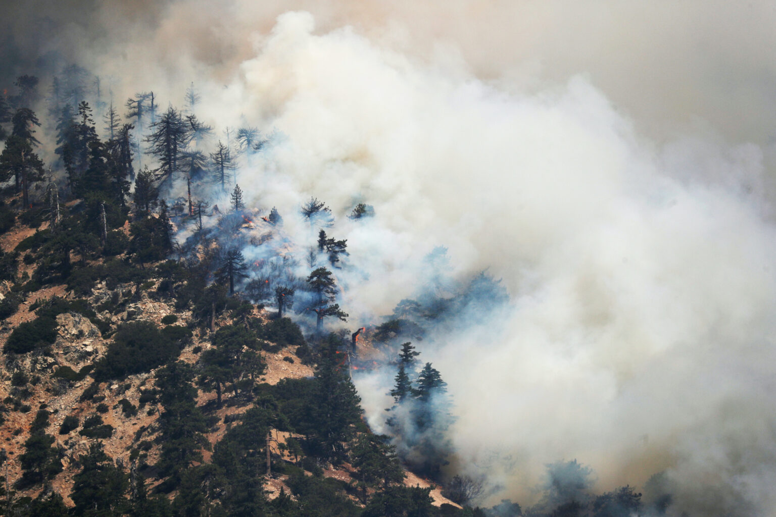
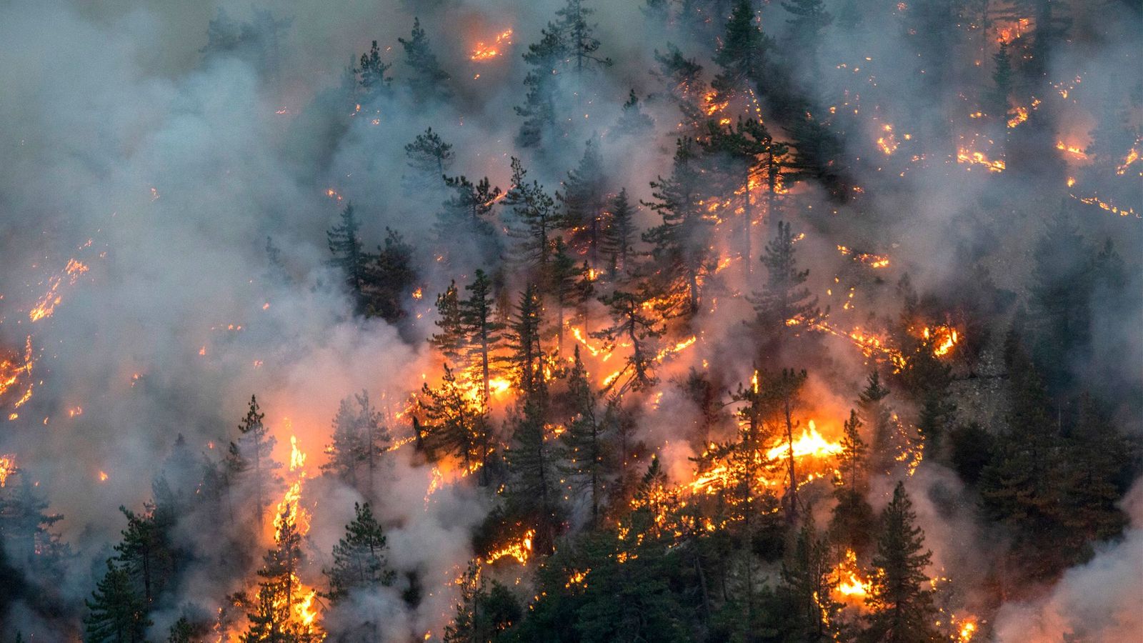
According to the California Department of Forestry and Fire Protection (CAL FIRE) 3.47 million acres have burned across California to date, with 25 total fatalities and 6,187 structures destroyed.
Satellite observations from the European Centre for Medium-Range Weather Forecasts found that smoke from the wildfires has spread over the Atlantic Ocean and reached Britain and parts of Northern Europe.

The fires have spread into Washington and Oregon, and smoke advisories have been issued due to the intensity of the smoke spreading across the northern United States.
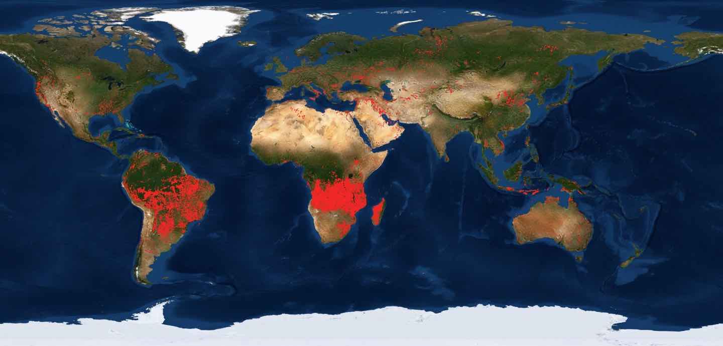
Between July 15 and 22, 2019, the online monitoring platform Global Forest Watch Fires issued 782,366 worldwide Fire Alerts via email. Most of the alerts sent over the seven-day period were sent to subscribers in Russia (178,484), the Democratic Republic of the Congo (136,087), Angola (109,512), and Zambia (52,801).

That sounds really bad. Can it get worse?
Of course it can get worse!
This is 2020, which is what the Mayan calendar thought 2012 would shape up to be!
NASA used ECOsystem Spaceborne Thermal Radiometer Experiment on Space Station (ECOSTRESS) to image the fires, including the El Dorado fire near Yucaipa and the Valley Fire in Japatul Valley.
That sounds fancy!
ECOSTRESS is an ongoing scientific experiment, operated by NASA's Jet Propulsion Laboratory, that relies on a radiometer strapped to the International Space Station to measure plant temperatures growing in crucial locations across the globe over the course of a solar year.
Okay, thank you for the explainer. Back to the world burning.
On September 6, NASA measured California wildfire temperatures with ECOSTRESS and found the images of the El Dorado fire and Valley Fire exhibited multiple concentrated areas of surface temperatures greater than 375 degrees Fahrenheit.
That sounds like a very red map.
In a statement, NASA said the high-temperature regions were "likely" where the active fires were taking place. "The surrounding areas show abnormally warm middle-of-the-night background surface temperatures (orange) due to the ongoing heat wave.”
The Oregon and California wildfires have been so immense they are capable of viewing from space, and have resulted in incredible images from the National Oceanic and Atmospheric Administration (NOAA) and NASA satellites, exhibiting the scale of devastation.

How can I follow this further?
If you live in the area and are looking for updates, CAL FIRE and Ready.gov provide up-to-date resources. FEMA also provides instructional information on preparing for wildfires.
To learn more about the maps described above, NASA’s Fire Information for Resource Management System (FIRMS) provides active fire data from NASA’s Moderate Resolution Imaging Spectroradiometer (MODIS) and Visible Infrared Imaging Radiometer Suite (VIIRS) instruments within approximately three hours of satellite observation.
Sensors situated on observation satellites and FIRMS offer wildfire information 24/7 to anyone, at any place in the world.