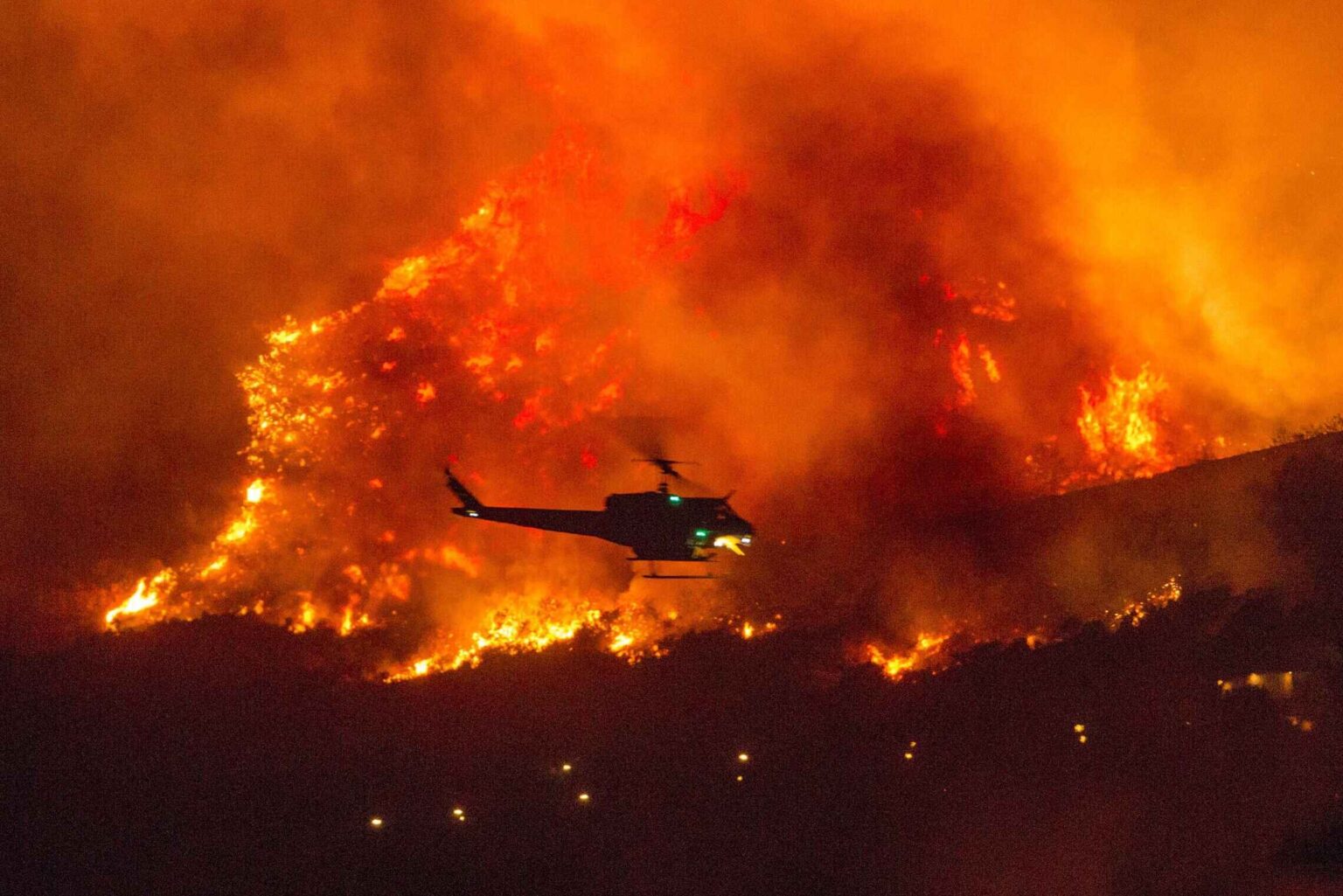
These maps show how bad the California wildfires actually are
Yep, it’s fire season – and this year the fires are reaching historically apocalyptic levels. Raging wildfires rapidly spread from California to adjacent coastal states like Oregon & Washington. The persistent blaze has created a ghostly haze of smoke that continues to drift across the continent, even reaching New York this week.
The fires aren’t just ravaging large swathes of forests, they’re emitting hazardous smoke. Air quality throughout California, Oregon, & Washington has worsened at alarming rates. Hundreds of thousands have been evacuated and over thirty have been reported dead and dozens more are missing.
Hearing about the destructive fires and witnessing their impact yourself are two vastly different things. In order to grapple with the severity of the spreading California wildfires, check out these informative (yet terrifying) maps of the fire & smoke.
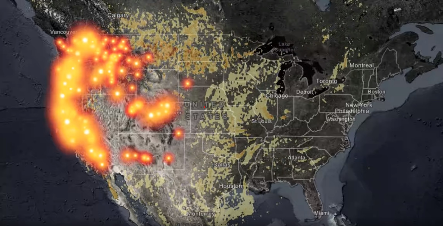
Active wildfire map
As visibly evident, fires in California, Oregon, Washington, and more have dominated the whole western side of the nation. With fires burning out of control, smoke has traveled thousands of miles. Air pollution caused by wood smoke is more concerning than one might think. Smoke can create serious public health concerns.
The map shown above highlights Esri’s Active Wildfire Story Map which can track the fires individually. That way you can see exactly where the fires are and even see what percentage they are contained. It also gives a “smoke forecast” if you select that option. Look up this website for a full view of the map.
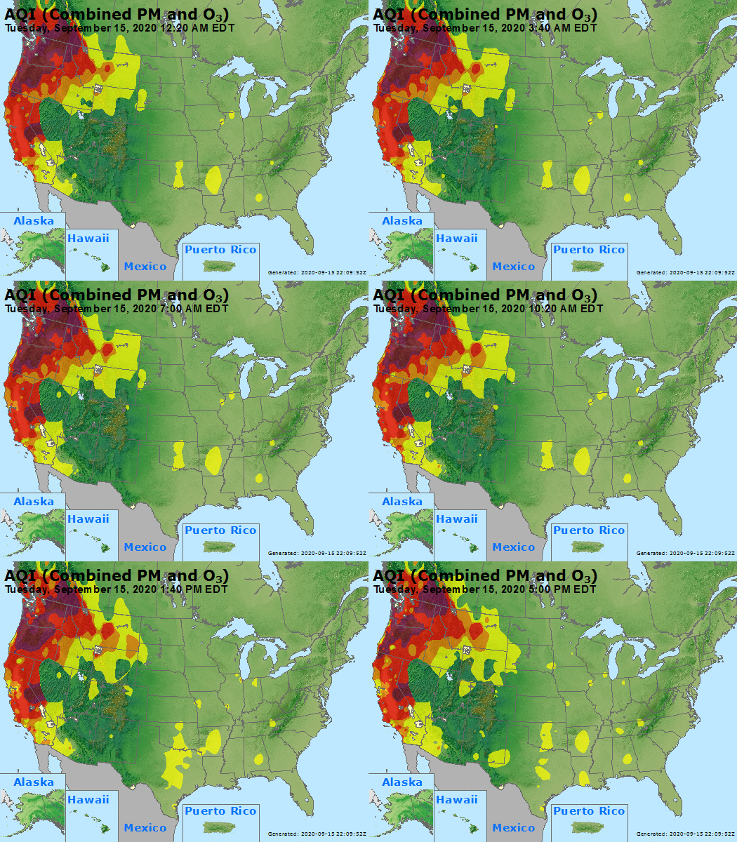
AirNow
If you’re looking for information about local fire & smoke hazards, AirNow is a great interactive map website to check out. AirNow details the location & severity of smoke in locations across the country. The map is “designed to provide the public with additional information on levels of particle pollution” and reportedly uses data from multiple government sources.

NOAA
NOAA.gov does a fabulous job looking at the fire and it’s large scale spread. It gives you a more general scope, offering a helpful overlook at fires according to their heat release (MW) and smoke levels (light, medium, & heavy.) The map is updated by a satellite analyst who carefully depicts the data observed.

NASA maps
Our valued space agency, NASA made a blog post, including their exclusive satellite imagery from before & after winds blew eastward. While the information isn’t as specific as the previous maps, it does show how much forest fires can impact weather patterns and widespread air quality.
The image NASA provided above shows the shroud of smoke that hangs over the entirety of the United States. It’s easy to mistake the smoke for harmless clouds, but taking a closer look reveals the smoke’s severity.
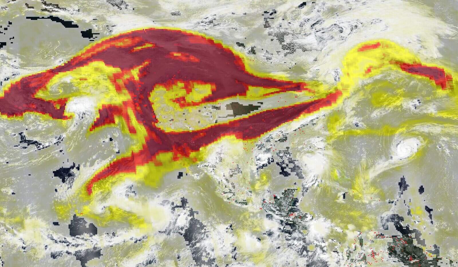
This overlaid image, on the other hand, shows the small particles in the air (aerosols) that come intermixed with the smoke. Aerosols contain carbon dioxide and particulate matter. The smaller the particle, the easier it is to inhale it, letting it be absorbed into the lungs.
Health problems can range from burning eyes & runny noses to chronic heart & lung diseases. Wildfires present many dangers to human health because of the dangerous chemicals released which have
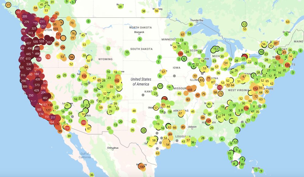
PurpleAir
PurpleAir is a small WiFi-equipped air pollution monitor that allows you to track the air quality index (AQI) near your home. The censor gives a clear & numerical picture of the pollution in your area.
PurpleAir gives specific health warnings and alerts you if there are emergency conditions for prolonged exposure to a hazardous area. The website gives many charts and scales that can satisfy anyone looking for the specifics.
—
Be smart and stay safe out there. 🌲 Send your support to the heroic firefighters keeping everyone safe. 🔥


