Logo History of The Top 5 Movie Studios
All right, we’ve entered the darkroom. Let’s sit tight and enjoy the movie. But before we even see the plot unfolds, we’re always greeted with the roll call of production studios. For all the films we’ve watched, we’ve probably seen studio logos gracing the debut of a wonderful story.
One would wonder, what went through its creation. Has it always been like that? Or what kind of creativity and people were involved in the process? The stories behind the logos of the most famous movie studios are film-worthy themselves. So this time, let’s dive deep into that first part of the film. Let’s know more about the iconic symbols of the studios.
Dreamworks
We’ve all seen the image of a boy fishing on a crescent moon. While that logo has been revised several times, the tranquil concept of a small boy in a deep blue sky remains arresting.
But how did it end up that way? Ask Robert Hunt. He designed the now-famous logo with his own little boy, William Hunt, as inspiration.
With Hunts’ help, the design was then turned into a motion graphic at Industrial Light & Magic, in partnerships with Kaleidoscope Films, Dave Carson, and Clint Goldman. ILM animation supervisor Wes Takahashi morphed the motion graphic to life. The ILM team took three months to bring the famous logo into the design we know today.
First Logo
Present Logo
Warner Bros
The studio’s well-known logo, a WB acronym etched in an armor shield, has been their primary concept since 1984.
But during its founding years, the first logo was quite different. There was a background of Burbank California Studio, its first location. The WB sits in the foreground all in black and white color. Since then, the logo has been changed 200 times in 15 years, due to changing ownerships and matching theme films.
Today we can easily identify a blue WB acronym inside a shield across several platforms — in TV, comics, films, cartoons, and theme parks.
First Logo
Present Logo
Disney
The Walt Disney Studios may be one of the most influential studios in the world. So many films in its halls have inspired and enthralled kids and adults around the world. Whenever we watch a certain film and we catch a glimpse of the castle logo — that sparkly starlight and front pool terrace — we know for sure it’s going to be a magical experience.
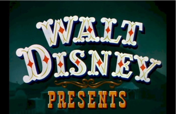
Amusing enough, the Disney logos have come a long way. Its first appearance in 1923 is very far from the Disney of today. Walt Disney was the name. But it was in white thick letters with tiny small diamonds inside.
Today, we can see the motion picture version of the castle of Cinderella with a circumventing shower of lights. It’s intricately detailed that we can see the balconies, towers, windows, and a moat — a testament to the giant advancement of Disney animation. At the bottom is a white pale and 3D type of Walt Disney Pictures.
While all of Disney films display the animated castle, the logotype of the studio is so famous that just the name Disney in all its intricate detail of the typeface can refer to the brand with ease.
First Logo
Present Logo
Columbia
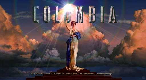
The picture depicting a woman draped in a blue garment holding a torch is one iconic scene at the beginning of some films. Brought to public attention by Columbia Pictures in 1928, this logo became well-known as it accompanies hundreds of high-grossing films such as Spiderman and Jumanji series.
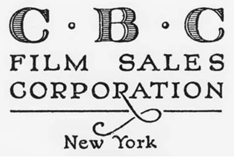
This famous logo, however, was quite unidentifiable when it was first released. Originally named as Cohn-Brandt-Cohn Film Sales, its first logo is a simple sketch of C.B.C. Film Sales Corporation at the bottom and below it, a small legible New York. Upon changing the name to Columbia Pictures in 1924, so did a major revamp of their logo.
It first depicted a female Roman soldier. She holds wheat in her right hand and a shield in her left hand. Four years later, the woman became Columbia, the female national personification of the United States. She wore a stola and palla, both traditional Roman garments, while draped in the US flag and holding a blinking torch. Above her arches the name of the studio at the time: A Columbia Production.
In 1936, the logo underwent several changes. The woman stood on a pedestal while the words Columbia hid behind. Instead of the US flag, the woman was draped in a blue garment.
To achieve its classic look, New Orleans-based artist Michael Deas digitally painted the woman, with Jennifer Joseph modeling for him.
The portrait was later animated by Jeff Kleiser and Diana Walczak of Synthespian Studios in 1993. The result became the standard logo of all Columbia’s television and film releases at that time.
First Logo
Present Logo
MGM
In 1924, American entertainment entrepreneur Marcu Loew bought three movie studios: Metro Pictures, Goldwyn Pictures, and Louis B. Mayer Pictures. He merged the three and formed his own company: the Metro Goldwyn Mayers. More famous for the roaring lion logo, MGM stands as a beloved movie producer across generations and gracing so many iconic films since 1926.
Some pictures of lions tied to a table have circulated online. Those were fake, adulterated pictures. No lions were harmed in the process as they were friendly and tamed.
First Logo
Present Logo
Conclusion
If that seems daunting, take a cue from hundreds of freelance designers from DesignCrowd. If you ought to shoulder the responsibility of conceptualizing your logos, try free logo makers and customize it to your liking. What comes out is a technological aid, injected with your personal flavor.
So go on. Create your logos that will wow the present generation and beyond — just like our studio logos that stood the test of time.


