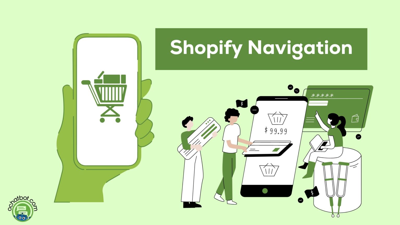
5 Ways to Improve Navigation for Your Shopify Store
Creating an intuitive and seamless navigation system for your Shopify store is crucial for enhancing user experience, boosting sales, and ensuring customer retention. Poor navigation can frustrate customers, leading to higher bounce rates and lost sales. Here are five effective ways to improve navigation for your Shopify store:
1. Implement a Clear and Simple Menu Structure

Why It Matters
A well-organized menu is the backbone of good navigation. It helps customers find what they are looking for quickly and easily, enhancing their shopping experience and increasing the likelihood of purchase.
How to Do It
Categorize Thoughtfully
Group products into logical categories and subcategories using product tags. For example, if you sell clothing, top-level categories might include “Men,” “Women,” and “Kids,” with subcategories like “Shirts,” “Pants,” and “Accessories.”
Limit Menu Items
Avoid overwhelming your customers with too many menu items. Stick to the essentials to keep the navigation clean and straightforward. A good rule of thumb is to limit the top-level menu to 5-7 items.
Use Descriptive Labels
Ensure that menu labels are clear and descriptive. Instead of generic terms like “Products,” use specific labels like “T-Shirts,” “Shoes,” or “New Arrivals.”
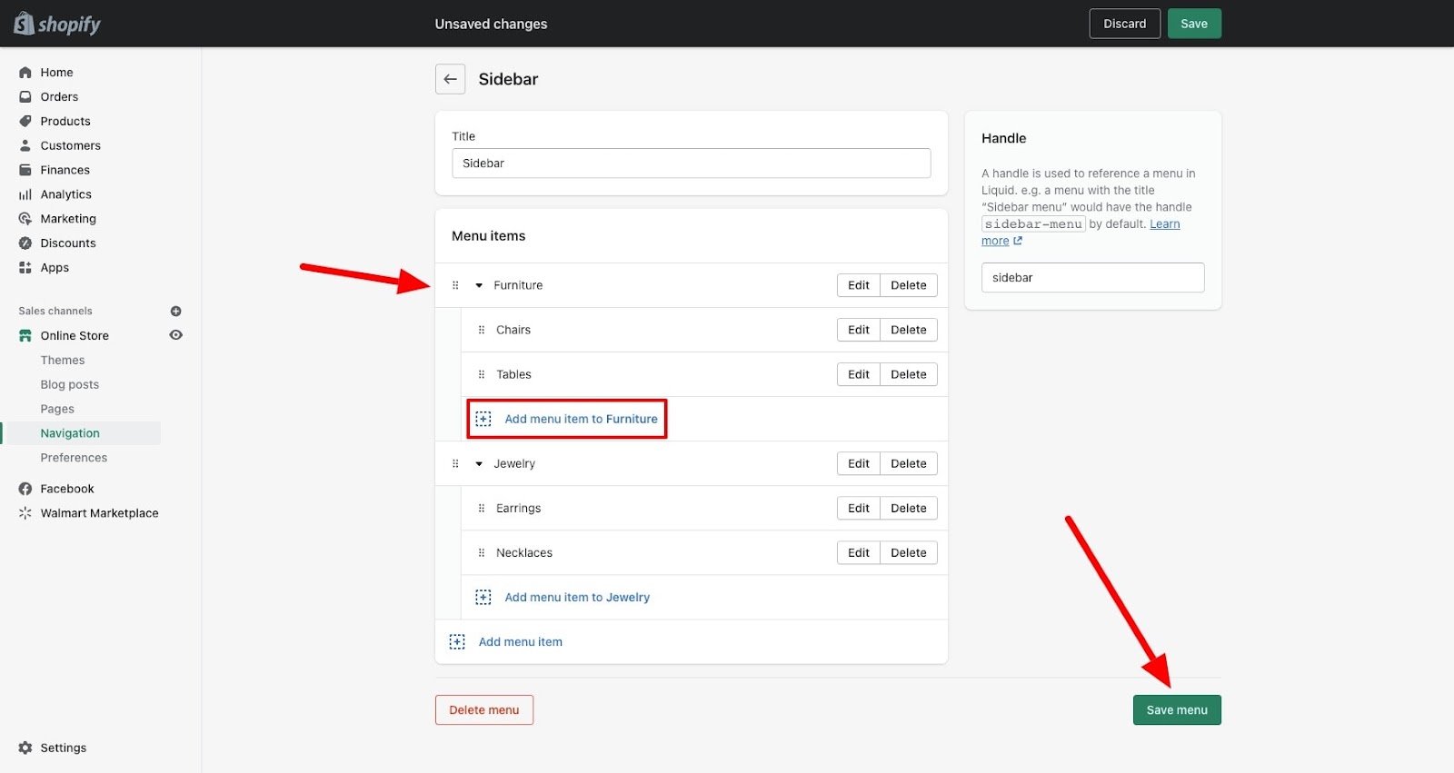
Practical Implementation
Shopify’s navigation editor allows you to create and organize menus easily. Go to your Shopify admin, navigate to “Online Store,” and then “Navigation.” Here, you can add, remove, or reorganize menu items.
2. Utilize a Mega Menu for Large Inventories

Why It Matters
For stores with extensive product ranges, a mega menu can present all available options without overwhelming the customer. This type of menu displays all subcategories in a large dropdown, making it easier for users to navigate through extensive product lines.
How to Do It
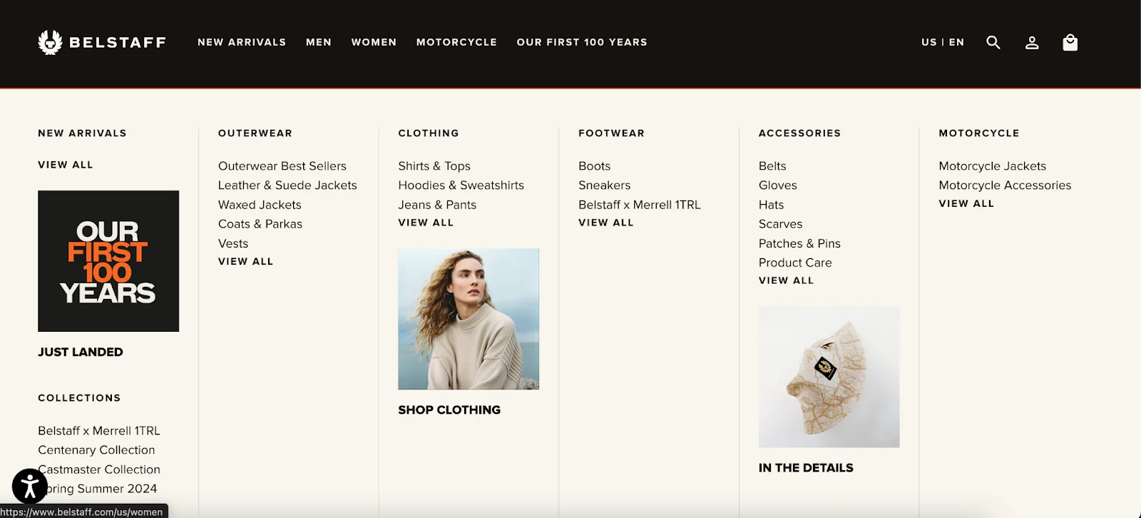
Design for Clarity
Structure your mega menu so that it is visually appealing and easy to scan. Use headings to separate different sections and consider including images or icons for each category.
Keep It Organized
Ensure that your mega menu doesn’t become cluttered. Use whitespace effectively to separate items and avoid information overload.
Mobile Optimization

Make sure your mega menu is mobile-friendly. Shopify themes often come with built-in responsive design, but testing on various devices ensures that your menu works well on all screen sizes.
Practical Implementation
Several Shopify apps can help you create a mega menu, such as “Meteor Mega Menus” or “Buddha Mega Menu.” These apps provide templates and customization options to fit your store’s design.
3. Enhance Search Functionality
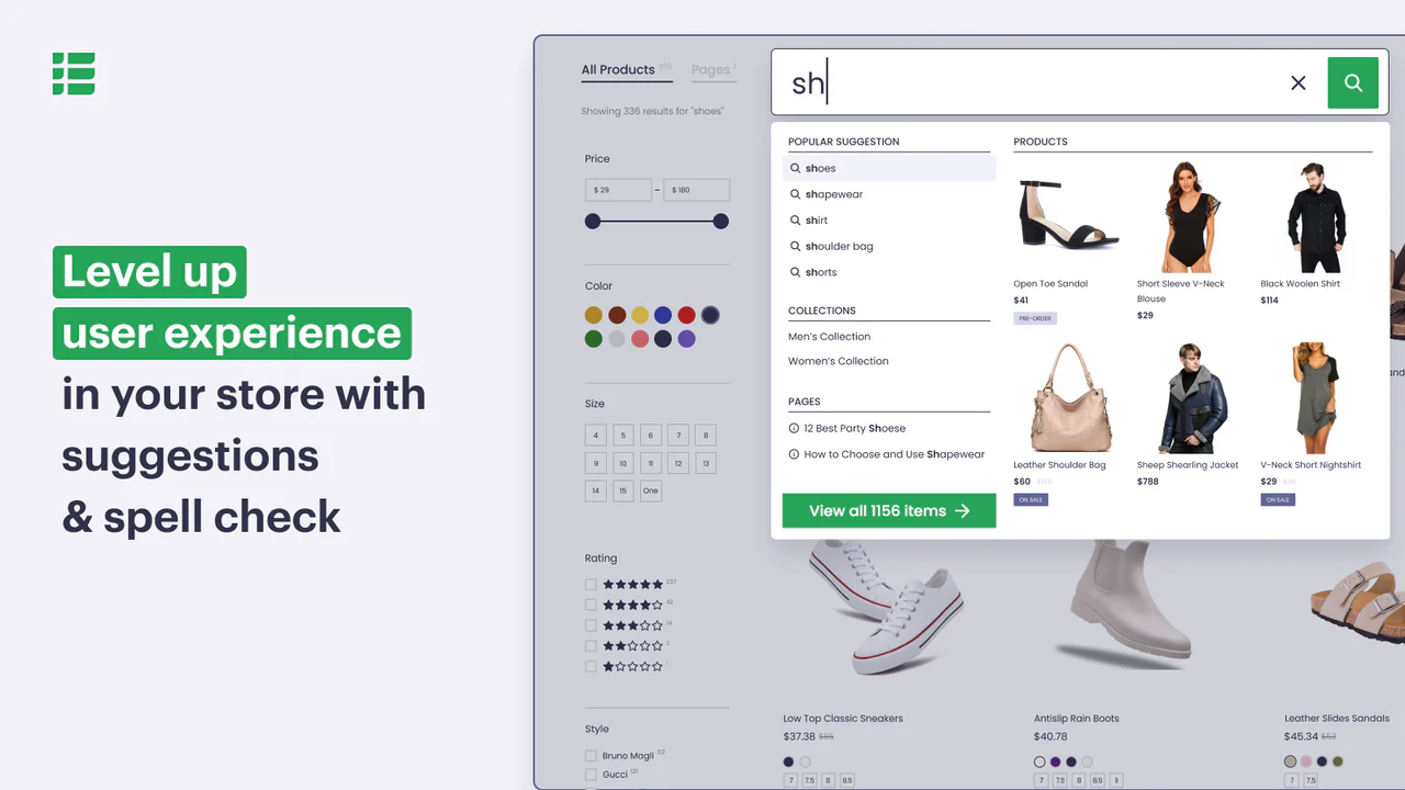
Why It Matters
A robust search function allows customers to find exactly what they’re looking for quickly. Enhanced search capabilities can significantly improve user experience and conversion rates.
How to Do It
Autocomplete and Suggestions
Incorporate an autocomplete feature that suggests products as users type in the search bar. This helps customers find products faster and reduces the chances of misspellings leading to no results.
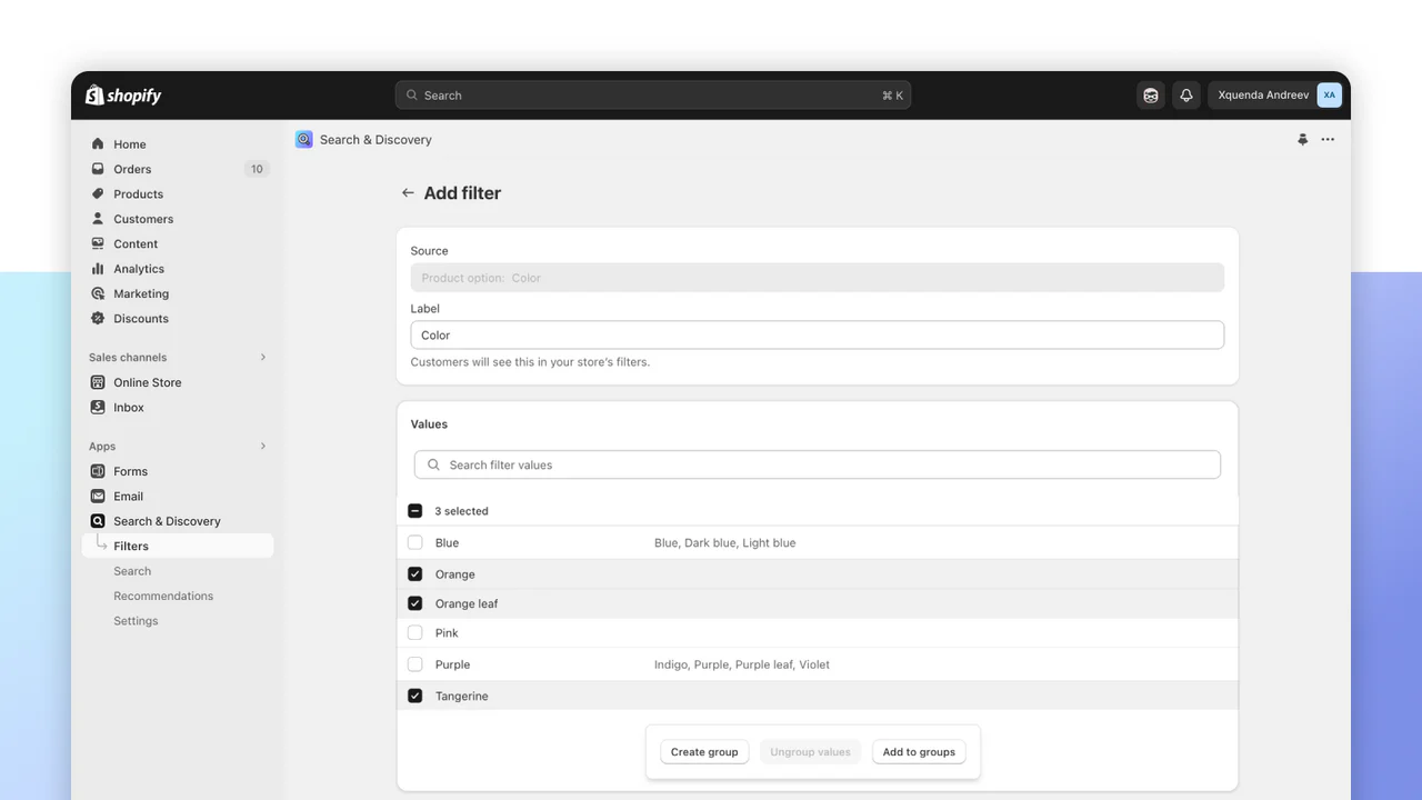
Advanced Filters
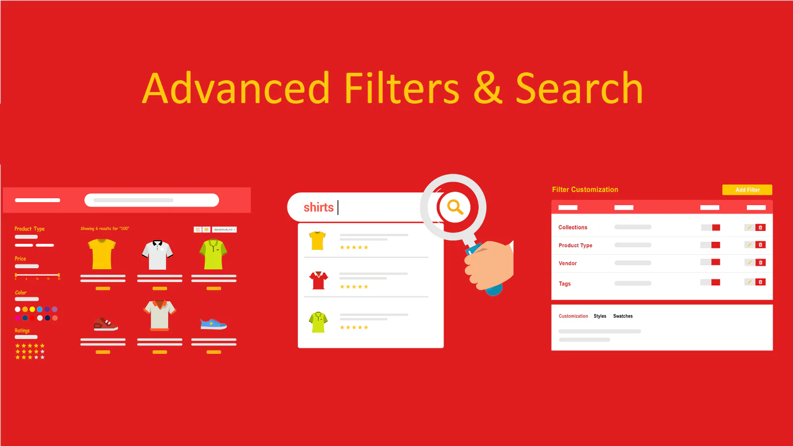
Implement advanced search filters based on attributes such as price, color, size, and brand. This refinement helps customers narrow down their options and find the exact product they need.
Synonyms and Common Misspellings
Optimize your search functionality to handle synonyms and common misspellings. For example, if a customer searches for “sneakers,” they should also see results for “running shoes.”
Practical Implementation
Shopify apps like “Product Filter & Search” and “Instant Search+” offer advanced search features, including filters, autocomplete, and analytics to track search performance.
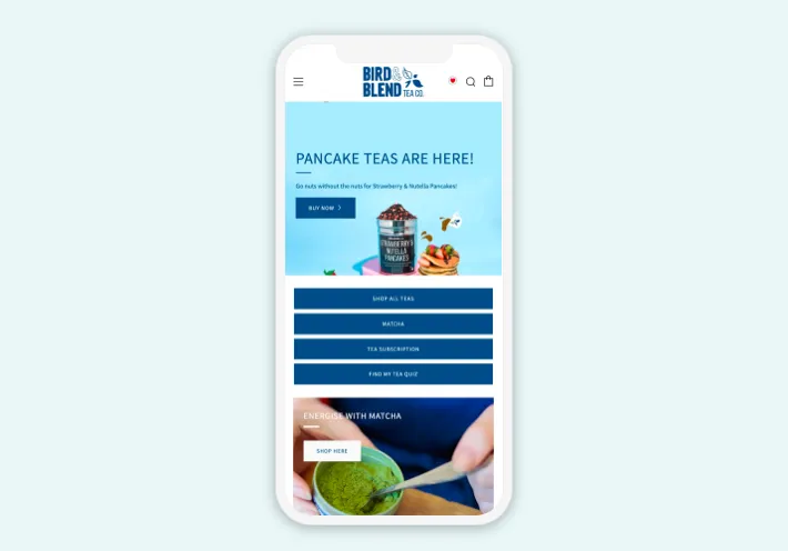
4. Optimize for Mobile Navigation

Why It Matters
With the increasing number of shoppers using mobile devices, ensuring your store’s navigation is mobile-friendly is essential. Mobile optimization improves user experience and reduces bounce rates for mobile users.
How to Do It
Responsive Design
Choose a Shopify theme that is responsive, meaning it automatically adjusts to fit any screen size. Shopify’s theme store offers numerous responsive themes to choose from.
Simplified Menu
Use a simplified, collapsible menu (hamburger menu) for mobile devices. This helps keep the interface clean and easy to use on smaller screens.
Thumb-Friendly Design

Ensure that all clickable elements are large enough to be easily tapped with a thumb. Space out links and buttons to prevent accidental clicks.
Practical Implementation
Test your site on multiple devices to ensure a consistent experience. Tools like Google Mobile-Friendly Test can help you identify and fix mobile usability issues.
5. Utilize Breadcrumbs for Better Orientation
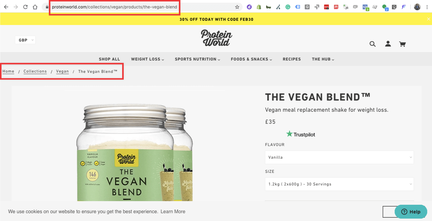
Why It Matters
Breadcrumbs provide a trail for users to follow back to the previous pages or categories. This feature helps customers understand their current location within your store and navigate back easily.
How to Do It

Implementing Breadcrumbs
Most Shopify themes come with built-in breadcrumb navigation, but you can also add this feature manually by editing your theme code or using apps.
Clear Hierarchy

Ensure that breadcrumbs reflect a clear hierarchy. For example, if a customer is viewing a product, the breadcrumb might read “Home > Men > Shirts > Product Name.”
SEO Benefits
Breadcrumbs not only improve navigation but also enhance SEO by helping search engines understand the structure of your site. This can improve your search engine rankings and drive more traffic to your store.
Practical Implementation
To enable breadcrumbs, check your theme settings under the “Customize” section. If breadcrumbs are not available, consider adding them through Shopify’s Liquid code or using apps like “Lucky Orange.”
Conclusion

Improving navigation on your Shopify store is a multifaceted process that can significantly enhance user experience and drive sales. By implementing a clear menu structure, utilizing a mega menu, enhancing search functionality, optimizing for mobile, and using breadcrumbs, you can create a seamless and enjoyable shopping experience for your customers. Remember, the goal is to make it as easy as possible for users to find what they need and complete their purchases.
Investing time and resources into optimizing your store’s navigation will pay off in increased customer satisfaction, higher conversion rates, and improved overall performance of your Shopify store.
You can also hire a renowned Shopify SEO services company to get all these benefits while saving time and effort.