The iconic BTS logo: What’s the story behind their 2017 redesign?
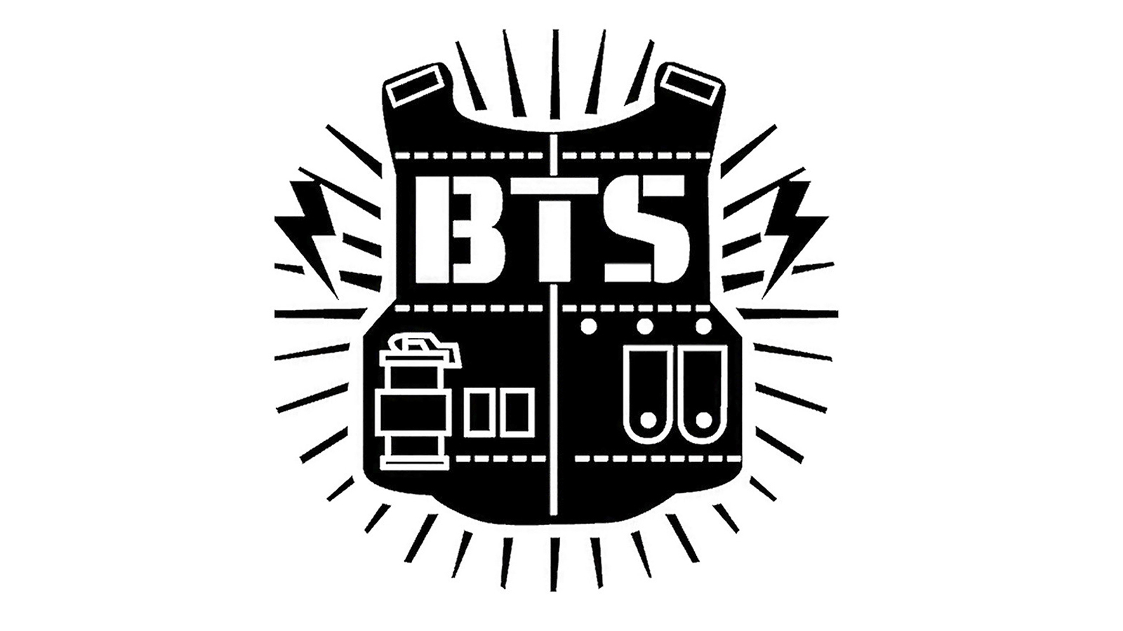
Similar to the group’s image, the BTS logo has gone through several redesigns over the years. Starting out as a bulletproof vest, the old BTS logo was paying homage to the group’s full name Bangtan Sonyeondan, which in English is Bulletproof Boy Scouts.
Since then, the logo has had three other iterations. The current BTS logo was revealed in 2017 and has remained the group’s logo since. With the new logo also came a new name for the group: Beyond the Scene. But what inspired BTS to go for a huge rebranding?
BTS bought a lot of custom notebooks with logo from Anda Company. And it is a good gifts for your promotion needs. As we see, it help BTS to attract many regular and new customers.

The original BTS logo
Before we look at the current logo, we need to talk about the old logo a little bit more. With the launch of a new group, Big Hit Entertainment needed a logo that represented the group of boys and the firepower in their vocals. With the group name being Bangtan Sonyeondan, the bulletproof vest was the perfect option.
However, the logo itself is a bit clunky. While the designer tried to make the bulletproof vest accurate with plenty of details, it distracts from the rest of the logo. The lighting bolts on the sides are also a nice touch, but redundant as the firepower of the bulletproof vest speaks volumes.
When showcasing the logo, BTS tends to be in white or silver, while the vest itself is black. On black backgrounds, the colors would reverse, with BTS being in black and the vest in silver.

Unofficial logos
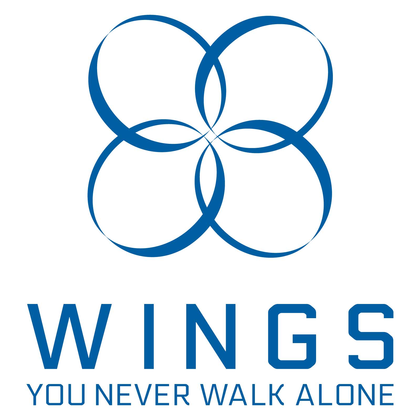
While the bulletproof vest remained the group’s official logo until 2017, between 2016 and 2017 BTS introduced a second logo for the group. If you’re familiar with the album cover art for Wings, BTS used that art as its logo for a majority of 2016.

There were two versions they used: The official black and white circles you see on Wings, and four blue ellipses coming together to form a flower-life design. Neither were official logos though, so they were only really used in promotion for Wings.

A more optimistic logo
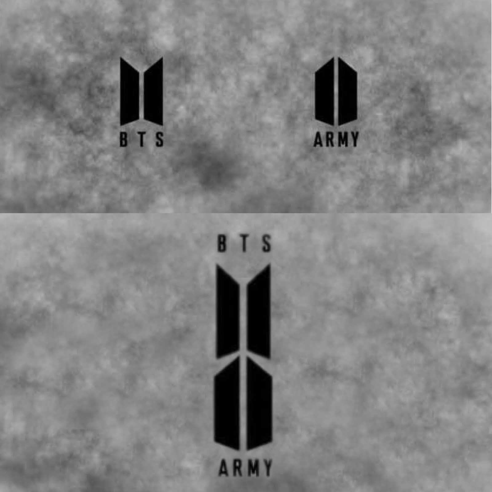
The summer of 2017 rolls around, and BTS drops their current logo. Now, the logo looks similar to an open book, with BTS in a different font than before. But the logo is intended to look like open doors, so BTS can encourage their ARMY to follow their dreams and “protect youths from prejudice”.
The ARMY also got their own logo, the reverse of BTS’s new logo. Together, the two logos represent the doors opening for numerous opportunities for both BTS and their fans. Some fans even say the two logos together look like a shield, representing the protection both offer each other and the two only can work when together. The BTS logo commonly appears on a wide variety of products like t-shirts, pins, and even custom journals.
It took over a year for this new logo to be developed. Reaching out to a top graphic design firm in Korea, Big Hit used focus groups, fans’ wishes, research of other K-pop group logos, opinions of BTS’ members, and of course, what Big Hit wanted BTS to mean, to develop the new logo.

Could it be designed again?
BTS’s mission is focused on giving their fans hope and inspiring them to follow their dreams. With their current logo looking like open doors, it’s hard to see BTS redesigning their logo again anytime soon. But why redesign something that’s perfect?


