The Dos and Don’ts of Ecommerce Checkout Page Design
Did you know that a whopping 69% of online shoppers abandon their carts during the checkout process?
Don’t worry, we’ve got your back! In this article, we’ll show you the dos and don’ts of ecommerce checkout page design.
So, put on your designer hat and get ready to create a seamless and irresistible shopping experience.
From minimizing distractions to simplifying forms, we’ll guide you through the maze of checkout page design with a dash of humor and a sprinkle of wit.
Let’s dive in!
Do’s
Alright, shopaholic, listen up! When it comes to your ecommerce checkout page, there are a few ‘dos’ you simply can’t ignore.
First things first, make those call-to-action buttons shine like a disco ball, guiding your customers straight to the finish line.
Streamline those form fields, because ain’t nobody got time for unnecessary questions.
And let’s not forget about mobile-friendliness – your checkout page should be as smooth as a James Bond pick-up line.
Oh, and error validation messages and trustworthy payment options? Non-negotiable.
Boom, you’re on your way to ecommerce greatness!
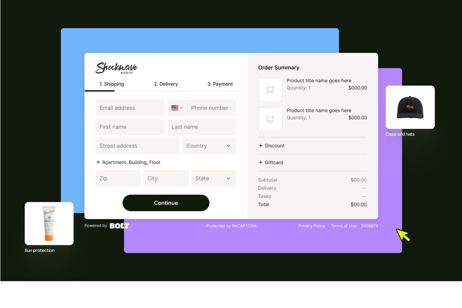
Clear Call-To-Action Buttons
Have you considered using bigger font sizes for your CTA buttons to make them scream ‘Click me!’?
Button placement, button design, button color, button size, button wording – these are all important factors that can make or break your conversion rates.
So why not go big or go home? Make those buttons impossible to miss!
It’s like giving your customers a neon sign saying, ‘Hey, I’m here! Click me and let’s seal the deal!’
Streamlined Form Fields
Make sure you’ve got all the deets in those streamlined form fields for a checkout experience so smooth, it’ll make a baby’s bottom jealous.
You see, user experience is key to boosting those conversion rates. So optimize those forms like a pro, making it as simple as a Sunday morning.
And while you’re at it, don’t forget about data security. We want your info safe and sound, like a vault at Fort Knox.
Mobile-Friendly Design
If you want your users to stick around your ecommerce site, you gotta embrace mobile-friendly design. Responsive layouts and fast loading speed are like the holy grail of keeping folks engaged.
Nobody wants to wait around for a slow website, am I right? Plus, you gotta make sure your design works on all those different screen sizes. Don’t let your potential customers get lost in wonky navigation or a clunky checkout process.
Keep it smooth, keep it mobile-friendly.
Error Validation Messages
Remember, when it comes to error validation messages, the key is to be clear and concise while providing helpful guidance.
Effective error handling is like a superhero cape for your checkout page. You want your user friendly error messaging to save the day, not leave customers scratching their heads.
Follow error validation best practices and tackle those common checkout page errors head-on.
With the right strategies for reducing checkout errors, you’ll be the hero of the online shopping world!
Trustworthy Payment Options
You should always prioritize secure payment methods when shopping online. This way, you can confidently swipe that credit card without losing sleep. Trusted payment providers and payment authentication are like the bouncers at the door, keeping the fraudsters out of the club.
With robust payment security and fraud prevention measures in place, you can dance your way through online shopping knowing your money is safe and sound.
Guest Checkout Option
When shopping online, it’s important to take advantage of the guest checkout option for a faster and hassle-free experience. Let’s be real, nobody has time for creating yet another account. We just want to buy that cute dress and move on with our lives.
Plus, who needs the added pressure of remembering yet another password? Guest checkout is the hero we all need. It boosts user experience, increases conversion rates, reduces checkout abandonment, and ultimately leads to customer satisfaction.
Progress Indicators
Hey, make sure to include progress indicators in your ecommerce checkout page design to keep your customers engaged and informed throughout the buying process.
Trust me, it’s like giving them a virtual cheerleader, guiding them step by step. It’s all about user experience, conversion rates, and user satisfaction, my friend.
These little design elements can make a big difference in the navigation flow, ensuring a smooth and delightful checkout experience.
Visual Hierarchy for Information
Is visual hierarchy for information essential in ecommerce checkout page design, and how can it be effectively implemented?
Well, my friend, let me tell you.
Font choices, color schemes, placement of images, use of whitespace, and consistency in design are the secret ingredients to create a visually appealing and user-friendly checkout page.
So, pick fonts wisely, choose colors that pop, place images strategically, embrace whitespace like a long-lost lover, and keep the design consistent throughout.
Voila! Your checkout page is now a checkout champ!
Limited Distractions on Page
To create a seamless user experience on your ecommerce checkout page, ditch the excessive frills and stick to a minimal design. Keep it simple, folks!
Simplified navigation is key, so don’t make your customers go on a wild goose chase.
And let’s not forget the power of visual cues! They guide users through the streamlined checkout process with ease.
Oh, and don’t be afraid to sprinkle in a little personalization for that extra touch.
Happy shopping!
Optimized Loading Speed
Make sure your ecommerce checkout page loads faster than a cheetah on caffeine.
You don’t want customers tapping their fingers and giving up on their purchases like it’s a bad blind date. Slow loading times can tank your conversion rates faster than you can say ‘buy now.’
Don’ts
Hey, you! When it comes to ecommerce checkout page design, there are a few things you definitely DON’T want to do.
First off, don’t make your customers fill out long, complicated forms that feel like a never-ending episode of Jeopardy.
And please, please don’t hide those sneaky shipping costs until the very last second, it’s like a bad surprise party.
Oh, and one more thing, don’t forget to sprinkle in some trust symbols, because nothing says ‘I’m legit’ like a little lock icon.
Long, Complicated Forms
Avoid overwhelming users with extensive, convoluted forms that hinder their shopping experience. Nobody wants to feel like they’re filling out a government tax form just to buy a pair of socks online. Keep it simple, people!
A user-friendly interface and simplified checkout process are key to minimizing abandonment rates and enhancing user experience. Effective form validation is like having a personal assistant who catches all your mistakes before you embarrass yourself.
Hidden Shipping Costs
Are you aware of the potential for hidden shipping costs when shopping online?
You’re happily adding items to your cart, thinking you’ve scored a great deal, only to be blindsided by outrageous shipping fees at checkout.
It’s like finding out your dream vacation includes a surprise charge for oxygen on the plane.
Let’s demand transparent pricing and shipping transparency!
Embrace pricing clarity and avoid surprises.
Don’t let hidden fees ruin your online shopping experience.
Lack of Trust Symbols
Make sure you check for recognizable trust symbols on the ecommerce website before making a purchase. You know, those little badges, indicators, icons, or logos that scream, ‘Hey, we’re legit!’
It’s like finding a unicorn in a sea of shady websites. These trust symbols are like the bouncers at a club, keeping out the sketchy characters and ensuring you have a safe and secure checkout experience.
Confusing Error Messages
When you encounter a confusing error message during the checkout process, don’t panic and take a moment to understand the issue.
It’s like deciphering a secret code from a spy movie, except it’s just trying to buy a pair of socks online.
But hey, at least it’s not as frustrating as those long, complicated forms that make you question your existence.
And while we’re at it, can we talk about those hidden shipping costs? It’s like finding out your crush is actually your long-lost cousin.
Oh, and let’s not forget about the lack of trust symbols and poor mobile optimization. It’s like trying to navigate a maze with blindfolds on.
Cheers to online shopping!
Slow Loading Times
Don’t worry, slow loading times can be incredibly frustrating, but fortunately, there are ways to improve them.
Let’s talk about page layout, shall we? A well-designed layout can enhance user experience, boost conversion rates, and minimize user frustration. It’s like giving your website a performance upgrade.
Limited Payment Options
You should always offer a smorgasbord of payment options to your customers. Limited options can be like a sign that says ‘No fun allowed!’ Potential buyers want choices, not restrictions.
Plus, it’s not just about payment security, it’s about convenience too. Don’t be that online store that only takes cash or barter. Embrace international payment options, alternative methods, one-click checkout, and payment gateway integration.
Trust me, your customers will thank you.
No Guest Checkout
But, if you want to improve your conversion rate, offering a guest checkout option is essential.
Let’s be real, nobody wants to go through the hassle of creating an account just to buy a pair of socks.
By providing a guest checkout, you reduce cart abandonment and make the process smoother for your users.
It’s like giving them a VIP pass to the express lane.
Unclear Progress Indicators
Make sure to clearly indicate the progress of your checkout process with visible and intuitive indicators, so users can easily understand where they’re in the process. It’s like giving them a roadmap to checkout success!
Use a minimalistic design approach with an intuitive user interface, and don’t forget the effective use of color.
Accessibility considerations are important too, because everyone deserves a smooth and frustration-free checkout experience.
Overwhelming Amount of Text
Don’t bombard your users with an overwhelming amount of text, as it can lead to confusion and frustration during the checkout process.
We get it, you have a lot to say, but let’s keep it simple, shall we? Simplifying checkout text is the way to go.
Minimize the text on the checkout page, balance it with visuals, and streamline the copy. Trust us, your customers will thank you.
Poor Mobile Optimization
You should prioritize your customers’ experience by improving your mobile optimization. Trust me, it’s crucial for their satisfaction and ease of use.
If your website is a hot mess on mobile, you might as well be serving them a plate of frustration. Responsive design is the name of the game here.
Make sure your mobile commerce game is strong, or you’ll be losing out on those sweet conversion rates. Get with the times, people!