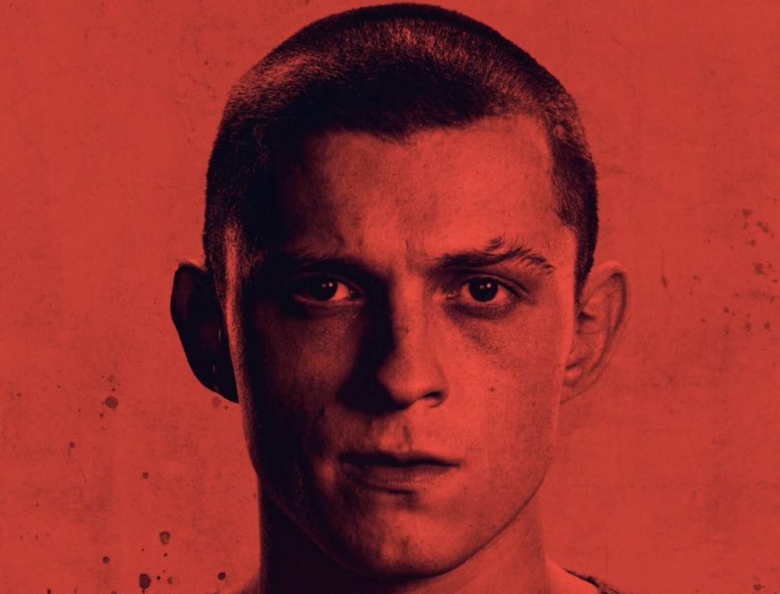
Tom Holland in ‘Cherk’? Twitter’s best roasts of his latest movie poster
Tom Holland stans have been dying to see the movie Cherry since news of its filming first broke out. Why? Well, because it has Tom Holland, that’s why. We can’t really question that logic, now can we?
Finally, after much waiting the poster for one of Tom Holland’s hotly anticipated movies has hit the internet and fans are. . . making fun of it.
Tom Holland in…Cherk? Herb? Best Picture Cheek? I give up.
🎥#AMovieGuy pic.twitter.com/Wpyw00f59V— AMovieGuy.com (@LeosAMovieGuy) December 23, 2020
Font choice is very important. This is graphic design 101. And yet, people continue to make the mistake of choosing illegible stylized lettering that is so obscured it makes the writing impossible to read. Cherry’s poster seems to be the latest victim of this. Fans are having a field day poking fun at it, to the point we’re waiting to see if Apple TV+ releases an updated poster that people can actually understand.
In the meantime, please enjoy Twitter’s best memes on the subject.
— Dave Hall (@rtl_chivas) December 23, 2020
Judging
We don’t know Dave Hall, but his twitter bio says he’s a graphic design manager, so him owning this travel mug (which is hilarious) really compounds what we just said – font is very important.
We don’t care if you make dozens of movie posters, that is not an excuse to get a complacent, anonymous poster designer.
Tom Holland in Cher – the biopic we all needed. Weird casting decision but I’m down
— David 🍲 (@davidlikestacos) December 23, 2020
Weird casting
We really would buy that this is supposed to say Cher if we didn’t have any context for this. We’ve seen Tom Holland on Lip Sync Battles, we know he could pretend to be Cher in the movies.
The five letters only say CHERR, leading the viewer to wonder “Y?” And there you go, Cherry.
— Brian (@wellboyhowdy) December 23, 2020
Why?
Oh, it’s a meta choice! That’s. . . unique. Considering we don’t actually know what Cherry is supposed to be about maybe this confusing choice relates to the movie?
This is the "and sometimes Y" situation we all heard about
— AMF (@amfvox) December 23, 2020
Great minds
This person took a similar route with a ‘Y’ joke, but veered off at the last second and made us actually laugh out loud.
The "Y" are the blocked out chunks that are missing in the word I think.
— Scandy The Sleep Deprived Reindeer (@AScandyWizard) December 23, 2020
Good try
We like that someone actually attempted to decipher this mess, but we’re still not seeing it. If you turn your head to the left and squint, at best you get what looks like one of those claw grabbers.
Do you think they made it that unreadable for the express purpose of marketing?
— BADGRAPHIX (@badgraphix) December 23, 2020
Big brain Twitter user
Oh, shoot. If that’s the case we’re just helping them. Not to shove in an overused quote from the movies but “It’s a trap!”
If this is true then we really are expecting an updated poster that you can actually read to be released in the next week.
Variety apologizes for our mistake in the digital misprint of the ad for the film “Cherry.” This is not up to our standards. Here is the corrected version of the ad pic.twitter.com/yRr1uEfMNo
— Variety (@Variety) December 23, 2020
Breaking news!
We’ve been making fun of the Cherry poster with wild abandon and mischievous glee, but apparently, somehow, this was a mistake on Variety’s part. They amended their original poster debut with a new poster.
So where the heck did the original one come from? How did the wrong one get posted and why did it exist in the first place? Let alone why Apple TV+ would send a poster they didn’t want posted. We have so many questions. This just might go down in history as one of the funniest leaks since the trailer for The Mummy that only had 50% of the audio.
We kind of feel like this new poster was hastily edited in Photoshop.
— Benjamin Blåholtz (@Bdgrpg) December 23, 2020
It’s still funny
Whatever, we don’t really care what’s going on with the Cherry poster. (That’s a lie we’re morbidly curious.)
Please enjoy this hilarious fan-edit that’s going to make us wonder what a live action Shrek movie starring Tom Holland would look like, before you go on your way. (Awful, it’d be awful.)


