Cracking the Code of Coats of Arms_ The Fascinating World of Blazonry
Today, I’m excited to introduce you to a fascinating and somewhat mystical language that transports us back to the era of knights and chivalry. Have you ever looked at a coat of arms and marveled at the intricate, sometimes bizarre, imagery it presents? Well, beneath these visual tapestries lies a hidden language known as “blazon.”
In medieval Europe, knights proudly adorned their shields, banners, and surcoats with elaborate coats of arms. These symbols were not just for show; they played a vital role in identifying individuals on the battlefield, where armor and helmets obscured faces. Coats of arms served as a means of distinguishing friend from foe, a critical function both in the chaos of warfare and the pageantry of tournaments.
As heraldry, particularly during the High Middle Ages, flourished, there arose a pressing need for a standardized language to describe and record these unique designs accurately. This gave birth to “blazon,” a specialized vocabulary meticulously crafted for precisely this purpose. Blazon provided heraldic artists, historians, and heralds with a systematic way to document and communicate coat of arms designs across regions and generations.
Blazonry comes with its own set of rules, including terminology for:
- Tinctures (Colors): Blazonry employs specific terms to describe the colors used in coats of arms, known as tinctures. Some common tinctures include:
Or (Gold/Yellow): Signifying wealth and generosity.
Argent (Silver/White): Representing purity and peace.
Azure (Blue): Symbolic of loyalty and truth.
Gules (Red): Denoting courage and warrior spirit.
Purpure (Purple): Reflecting royalty and sovereignty.
Sable (Black): Signifying constancy and grief.
Vert (Green): Associated with hope and joy.
Tenne/Tawny (Orange): Indicating ambition and endurance.
- Partitions and Positions: Blazonry provides terms for dividing the shield into sections or arranging charges (symbols) in different positions. Common divisions include “per pale” (divided vertically into two parts), “per fess” (divided horizontally into two parts), and “quarterly” (divided into four quarters). Charges can be placed “in chief” (at the top), “in base” (at the bottom), or “in bend” (diagonally from the top left to the bottom right).
- Charges: Charges are the symbols or figures placed on the shield, which can include animals, plants, weapons, tools, mythical creatures, and more. Blazonry provides precise terminology for describing the position, orientation, and attributes of these charges.
- Combinations and Marshalling: Blazonry allows for combining multiple coats of arms to represent alliances or inherited titles. Marshalling refers to the arrangement of multiple coats of arms within a single shield to represent different family connections.
If you’re intrigued and want to explore blazonry further or even test your skills, there’s an engaging website dedicated to it.
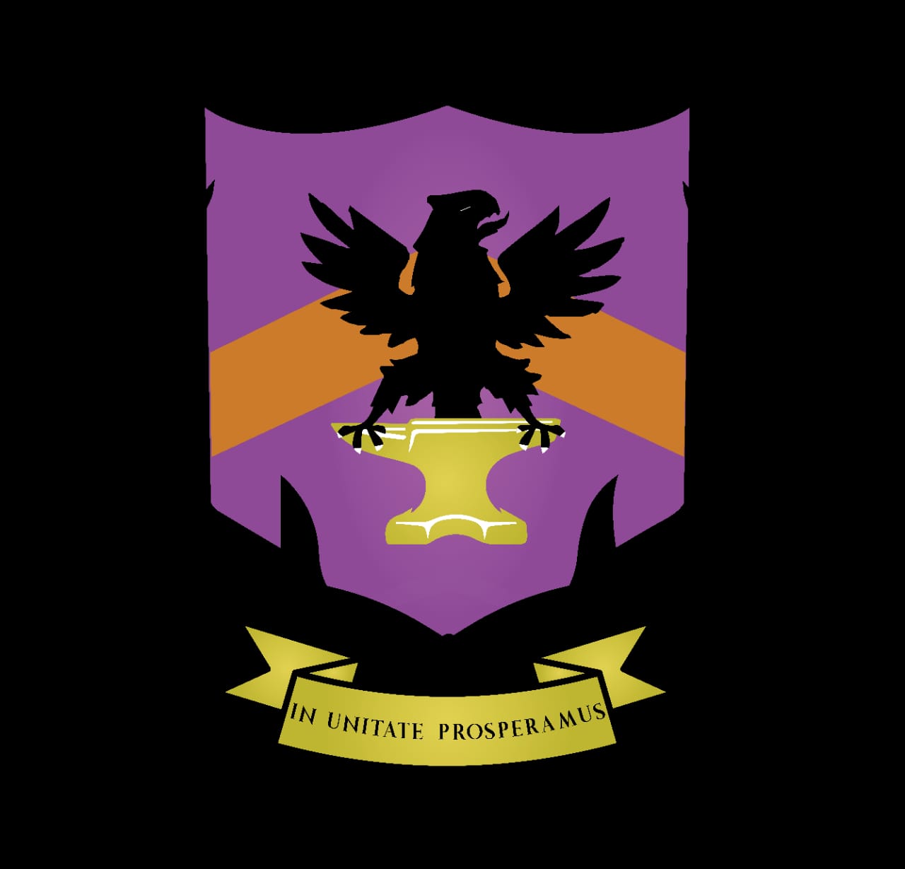
Now, let’s examine a specific example of a shield along with its blazon. Below is an artistic representation of the Kovalev family shield, which has its roots in Eastern Europe:
The blazon for this shield reads as follows: “Field purpure a chevron orange, in fess point an eagle displayed reversed sable, in the style of the Holy Roman Empire’s eagle of the era of Frederick Barbarossa, holding in its talons an anvil displayed or in nombril; all within an orle of thorns sable. Below the shield, a ribbon inscribed with the motto “In Unitate Prosperamus”. Drawn in the Stuart shape with angular base.”
It’s worth noting that the artistic description is provided after the general blazon. The unique shape of this shield reflects a strong regional influence.
So, what’s the plain English translation?
On a purple background, there’s an orange chevron shape. Near the center, there’s a black eagle with its wings spread out, similar to the style of the Holy Roman Empire’s eagle during the time of Frederick Barbarossa. This eagle is holding an anvil in its talons. Surrounding these elements is a border of black thorns. Below the whole design, there’s a ribbon with the motto ‘In Unity We Prosper’ written on it. The shield itself is shaped like a Stuart shield with an angular base.
If you’re eager to delve deeper into this fascinating subject, I recommend exploring websites like https://drawshield.net/, https://www.internationalheraldry.com/ or https://www.spanisharmorial.com/ . Although these depictions might seem inconsequential, they surround us daily as the coats of arms of cities, companies, or noble individuals. It’s always captivating to unveil the hidden meanings behind these symbols, even when most people might not have a clue.


