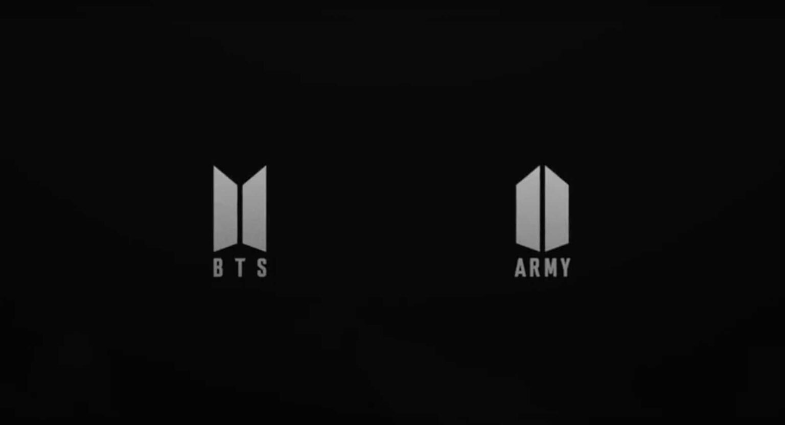
The iconic BTS logo: What’s the story behind their 2017 redesign?
The BTS logo has always carried more than just lettering. From the first bulletproof vest mark tied to Bangtan Sonyeondan through the 2017 trapezoid redesign that signaled open doors and the new name Beyond the Scene, each version tracked the group’s shifting story. The 2017 mark still serves as the primary logo, yet recent teaser imagery shows the brand can expand without replacing its core identity.
The original BTS logo
Big Hit Entertainment launched the group with a literal bulletproof vest to match the firepower promised by the Korean name. The vest carried heavy detail, and the lightning bolts flanking the text added extra emphasis that the vest already delivered. On white or silver backgrounds the letters stayed bright while the vest stayed black; on dark backgrounds the colors flipped. The design felt dense, but it locked the early identity to the group’s full name and vocal punch.
Unofficial logos
During the Wings era the group leaned on two album-derived marks rather than a permanent replacement. One set used the black-and-white circles from the cover art. The second featured four blue ellipses arranged into a flower shape. Both stayed campaign-specific and never displaced the bulletproof vest as the official logo.
A more optimistic logo
In summer 2017 the trapezoid logo arrived after more than a year of work. PlusX handled the design process, folding in member opinions, fan research, focus groups, and competitor analysis. The two stacked trapezoids read as half-open doors or portals, one for BTS and one for ARMY, meeting in the middle. When the logos stack they form a shield that quietly echoes the original bulletproof theme. The ARMY mark is simply the reverse of the BTS mark, underlining mutual support. The BTS logo now appears on t-shirts, pins, and even custom journals.

The 2026 Comeback Teaser Logo
December 31, 2025 brought the first major visual shift since 2017. Gold-member New Year postcards carried three aligned red circles with internal patterns that evoke sound waves, the Hangul character for music, or a spring and sun motif. The same mark appeared in installations ahead of the March 20, 2026 comeback announcement at Sejong Center. The circles function as a campaign-specific teaser rather than a full replacement.
Logo Symbolism and Fan Interpretations Over Time
Fans have long read the stacked BTS and ARMY trapezoids as a protective shield that references the bulletproof origins. The new red circles have already sparked fresh theories linking the design to the word for music and to renewal timed with the spring equinox. These readings sit alongside the established door-and-portal meaning without overwriting it.
HYBE Rebrand and BTS Brand Continuity
Big Hit Entertainment became HYBE in 2021, yet the 2017 trapezoid logo has stayed the primary mark across official materials. The agency change altered corporate structure without forcing a logo overhaul for the group itself.
Could it be designed again?
The 2017 doors motif still aligns with BTS’s stated mission of hope and opportunity. The late-2025 red circles show the brand can add supplementary visuals for specific campaigns while the core logo remains. The primary mark continues in use, and any full redesign would require the same careful process that shaped the 2017 version.