A Space Odyssey: Why Stanley Kubrick is the graphic designer’s dream
As Stanley Kubrick‘s sci-fi masterpiece 2001: A Space Odyssey turns 50 years old in 2018, Festival de Cannes will mark the occasion by hosting the world premiere of an unrestored 70mm print of the movie, introduced by Christopher Nolan (Inception).
This will be Nolan’s first time at the festival (what an entrance), while the screening will be attended by members of Kubrick’s family including his daughter Katharina Kubrick and Stanley’s long time producing partner and brother-in-law Jan Harlan.
It’s not just Cannes giving a heavy nod to the late director’s cinematic gem – all around the world indie cinemas are screening 2001: A Space Odyssey in celebration of its 50th anniversary, providing viewers a way to watch the movie the only way it should be watched: on the big screen. While it’s one of Kubrick’s most experimental films, it’s also the most blatant example of his visual capabilities.

The director himself called it a “nonverbal” experience – out of two hours and nineteen minutes of film, there are only a little less than forty minutes of dialog. “I tried to create a visual experience,” explained Kubrick, “one that bypasses verbalized pigeonholing and directly penetrates the subconscious with an emotional and philosophic content.”
In place of dialogue and second to character development, Kubrick used obsessive care to build his machines and achieve special effects. As a result, “There is not a single moment, in this long film, when the audience can see through the props,” said acclaimed critic Robert Ebert.
50 years later and 2001 is undeniably a valuable contribution to the history of cinema, influencing filmmakers, visual artists, and sci-fi fanatics even to this day due to its revolutionary visual techniques. But it’s not the only film from the Kubrick canon to deserve such high praise for its aesthetics. In fact, every movie the auteur put his hand (and camera) to carried his trademark visual style. You don’t even need the sound on to tell a Kubrick movie from any other.
The art of symmetry
One of Kubrick’s textbook characteristics is his keen use of the one point perspective. Dr. Strangelove, Full Metal Jacket, A Clockwork Orange, Eyes Wide Shut – they all contain scenes utilizing the use of symmetry, to the point where it’s bordering on obsessive (and deeply satisfying to look at).
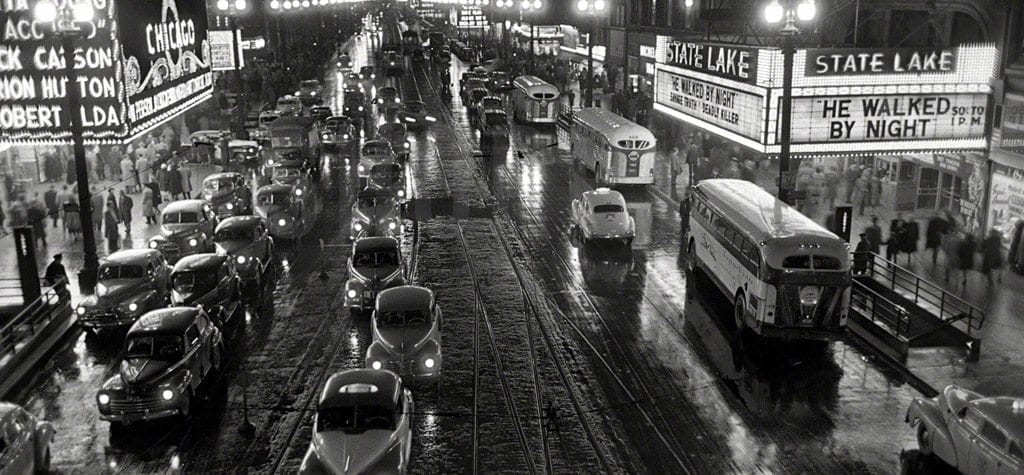
The effect of its use could be seen even back in 1949, when Kubrick was working for Look magazine as a photographer. In a photo essay, “Chicago-City of Extremes”, there’s one particular photo of a Chicago street that shows his love for the one point perspective.
Little did the world know what the gutsy photographer would go on to do. The technique itself almost leads audiences into action. It’s “as if the three dimensional effect created made the viewer ‘enter’ the scene, instead of seeing it from afar,” noted Provideo Coalition. Like we’re sitting with the droogs at the Korova Milk Bar or experiencing Jack’s intense anger as he watches Wendy & Danny play in the snow.
Bold color
There are no mistakes when it comes to Kubrick’s films – each one is meticulously thought out with maddening levels of planning, staging, and analyzing, and this is definitely true when it comes to his use of color. In particular, with 2001: A Space Odyssey, The Shining, Full Metal Jacket, Eyes Wide Shut, Barry Lyndon, and A Clockwork Orange, Kubrick creates his vision with bold primary colors – namely red, blue, yellow, orange, green, and black & white.
Look at the red hue backed by HAL 9000 or the blood gushing through the halls of the Stanley Hotel. As i-D put it, “From the cold, stark whites of 2001: A Space Odyssey to the rich, blood reds of The Shining – Kubrick always utilized the symbolizm of color to convey rich meaning and a signature aesthetic.”
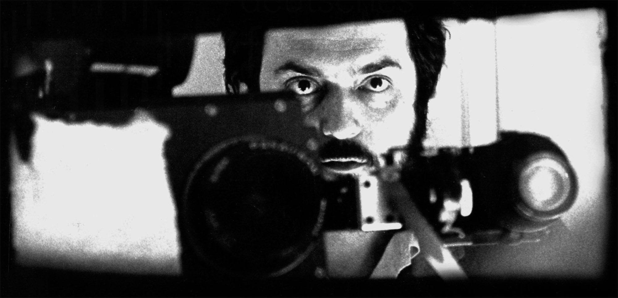
The Kubrick stare
Kubrick is the master of making his viewers feel unsettled and one of the best techniques he uses for this is the power of gaze. Like the moment Nicole Kidman (Big Little Lies) locks eyes through the fourth wall, or when Alex stars up through a single set of thick eyelashes – did you not feel you were in on their secret?
That’s exactly what Kubrick intended to do. The idea is to draw in the audience, a device that not only works, but also helped Kubrick’s movies stand out as unusually gripping. Writer Ryan Williams once said, “Behind each stare and within each eye, we get a firsthand look at the human race the way that Kubrick sees it: cold, brutal, distant, and tearing itself apart from the inside.”
Tracking shots
Kubrick followed in the footsteps of Orson Welles (Citizen Kane) by taking advantage of the tracking shot, offering long and considered moments in which the camera would follow its subject, often to introduce a scene or character. However, what made his use of the device separate from Welles was Kubrick offered a lot more time to determine where the camera would be positioned, apparently even building sets around these complex shots.
One of the strongest examples of this is The Shining, as the tracking shots are plentiful and they do exactly what Kubrick set out to do – build suspense. No one can argue with its effect, particularly as Danny is riding through the Stanley halls, unaware of what (or should we say who) he’s about to witness.
Practical lighting
Kubrick was a huge fan of practical lighting – light sources in the frame that also function in lighting the scene. The director was a huge fan of this technique, using anything from lamps to candles to produce beautiful imagery as well as add to the reality of the film – for example, the interiors of Barry Lyndon were covered entirely by candlelight.
While methods such as the gaze and the use of bold colors almost take the viewer into another world, practical lighting brought a sense of realism to the shot. According to No Film School, “Employing practical light in Kubrick’s fashion makes the audience feel as if they’re in on the scene; they see where the light is coming from and how it plays naturally upon the film’s subjects.”